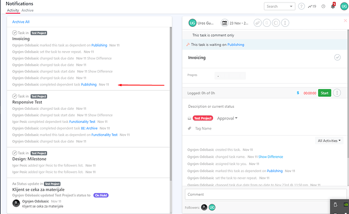
Let’s take example, we have TASK 1 and TASK 2 that is depended from TASK 1. This two tasks are assigned to two different users.
If USER 1 mark TASK 1 as finished, USER 2 should have better notification that dependable task has been finished and TASK 2 should be started from his side.
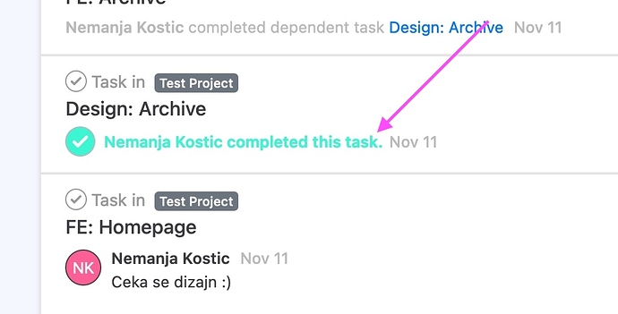
From UX point, so much time with eyes needed to read all information. So highlighting this notification will be great job.
.
We are thinking about only sharing critical changes in a task in the notification view going forward.
Let us know what updates you would like to see here.
Fast correction can be that in UI this crucial links:
- maybe sorting of notification should be from top to bottom… now at bottom is latest change. Or to make in user option that he can choose way of showing
- crucial status/changes can be with small “tag” or tiny icon or maybe just different font color to be easier to track
- maybe status of single task can be grouped so important is easily visible, “read more” can expand all statuses per task
Additional thing, having connection with colors, in platform UI contrast must be better this is not so visible and it very dependent from quality of screen. Screenshot is zoomed version but 1:1 is even more less visible.

